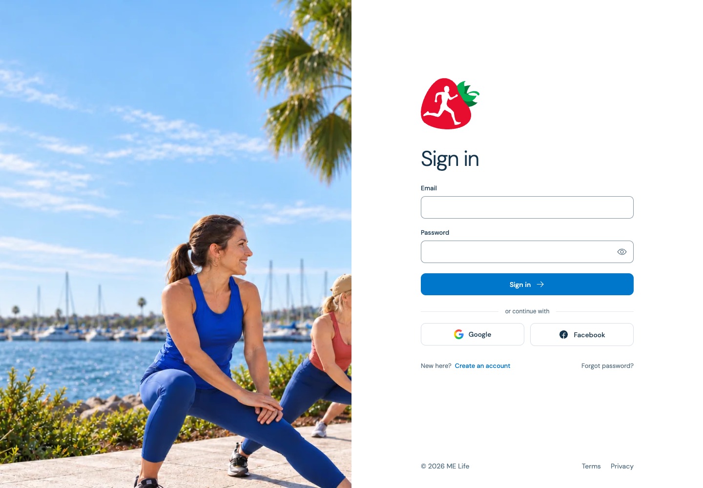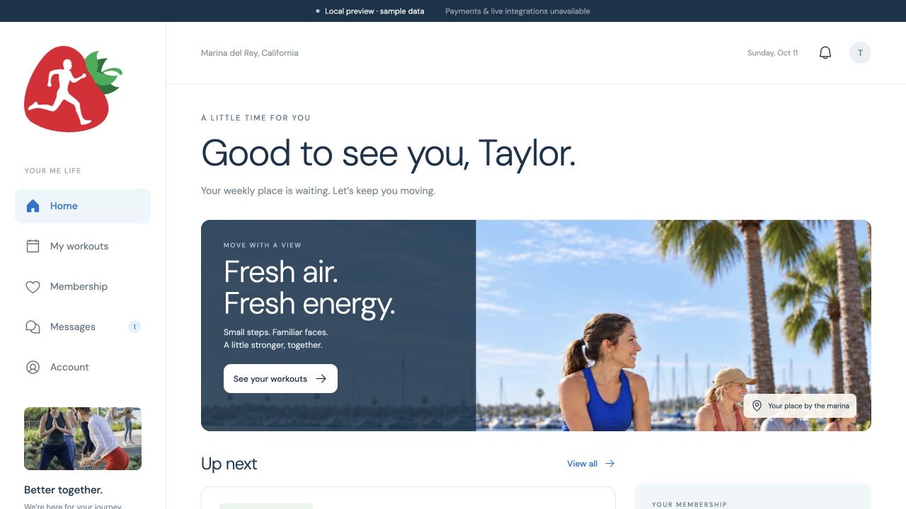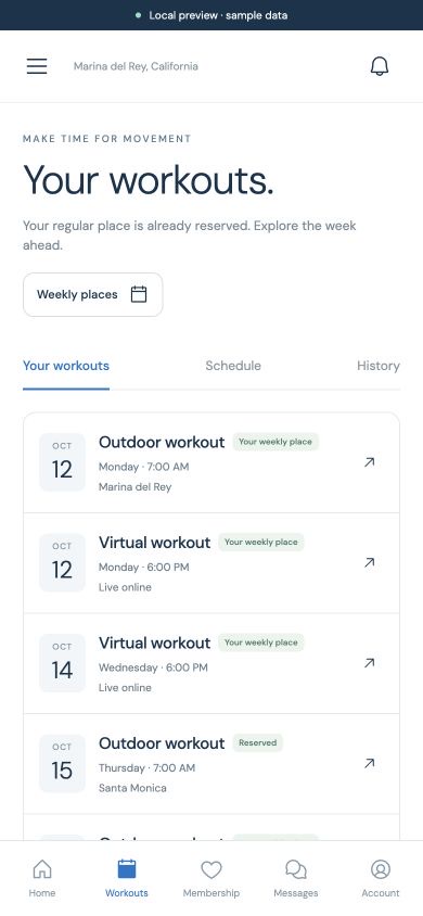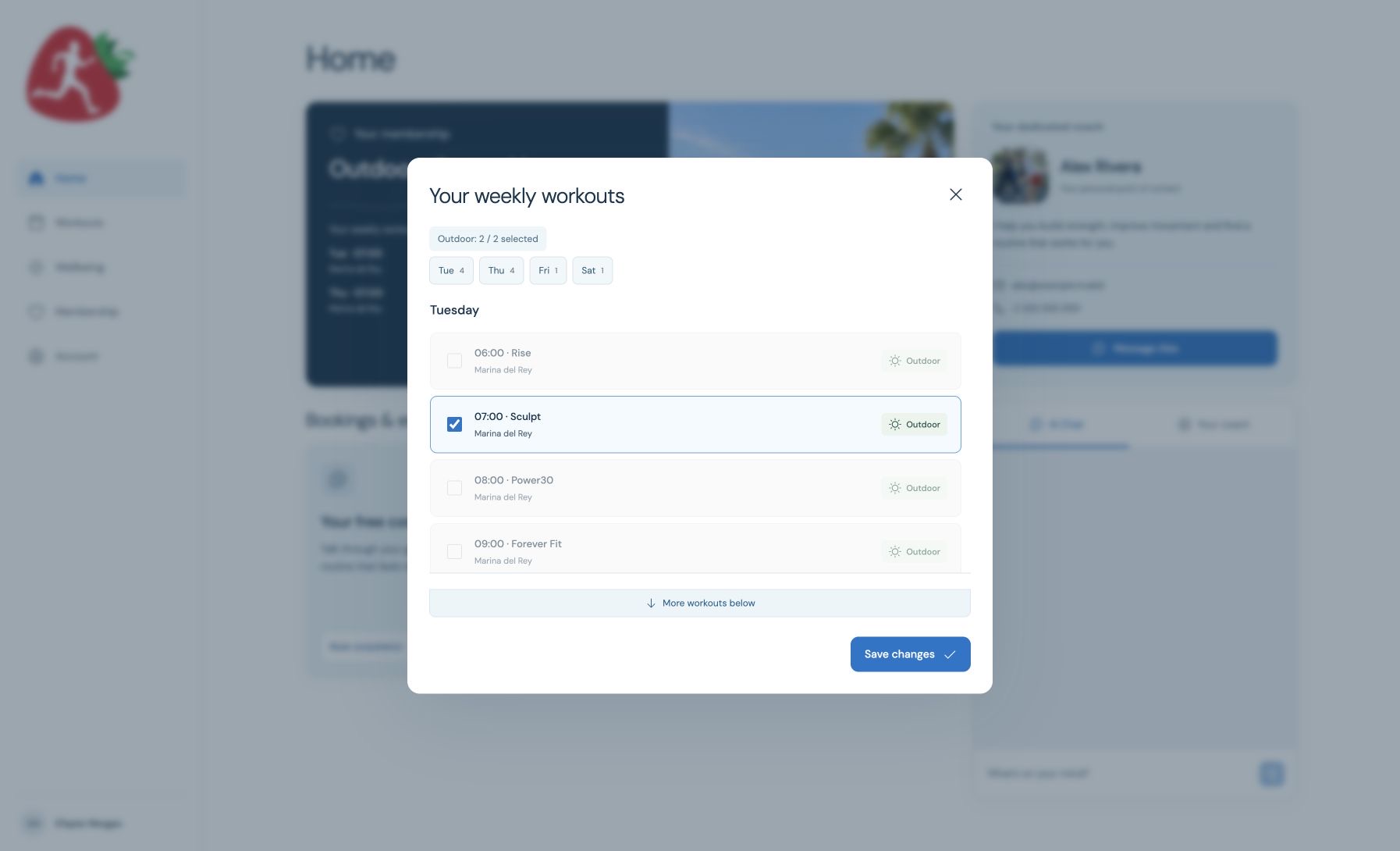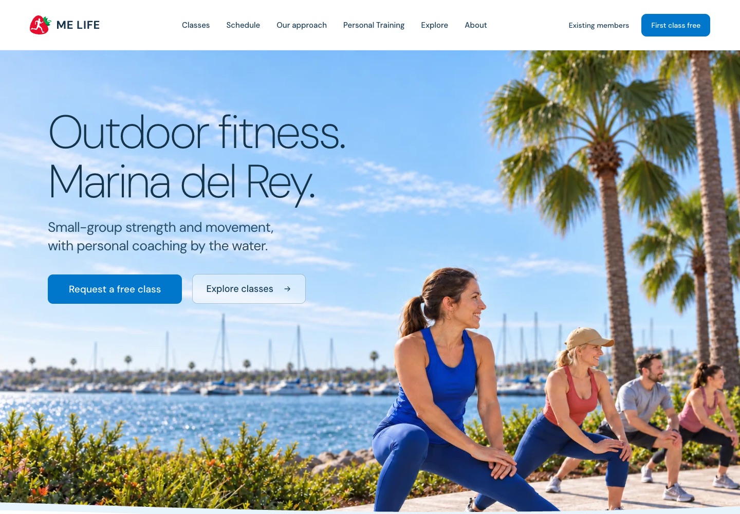
The public site and the portal solve different moments in the same relationship. The website helps someone decide whether ME Life feels right. The portal has to make the decision useful every week after that.
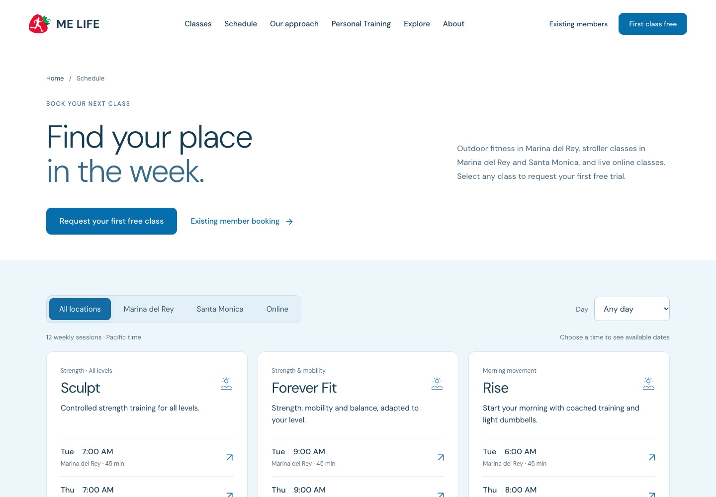
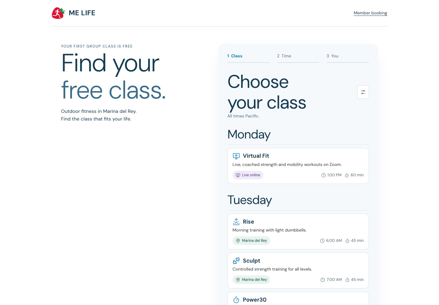
That distinction shaped the project. I did not want a polished marketing site that handed the customer into a generic account area with different language, priorities, and visual behavior. I treated the entire path as one product: understand the offer, find a class, try it, choose a membership, establish a weekly place, and know what happens next.
The work crossed product strategy, brand, writing, interaction design, frontend and backend engineering, membership logic, payments, staff operations, and cloud delivery. The useful part was not doing those disciplines separately. It was keeping them pointed at the same customer promise.
A member should not have to understand ME Life’s systems. The systems should remember the member’s routine, make the next step obvious, and leave room for a human relationship with the coach.
A brand has to behave, not just look consistent
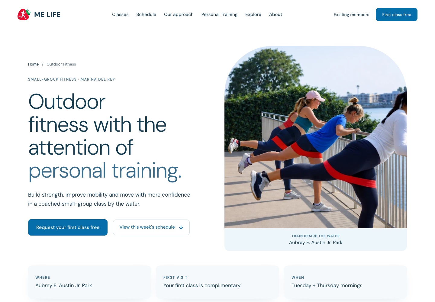
ME Life is built around coached movement outdoors, close to the water, with a level of personal attention that is easy to lose in conventional fitness marketing. The website needed to feel like that experience before a visitor attended a class: open, calm, confident, local, and human.
I used a restrained coastal palette, generous spacing, direct photography, and typography with enough scale to create clarity without becoming loud. The language avoids transformation theater and pressure. It talks about a regular place in the week, expert guidance, fresh air, and movement that fits real life.
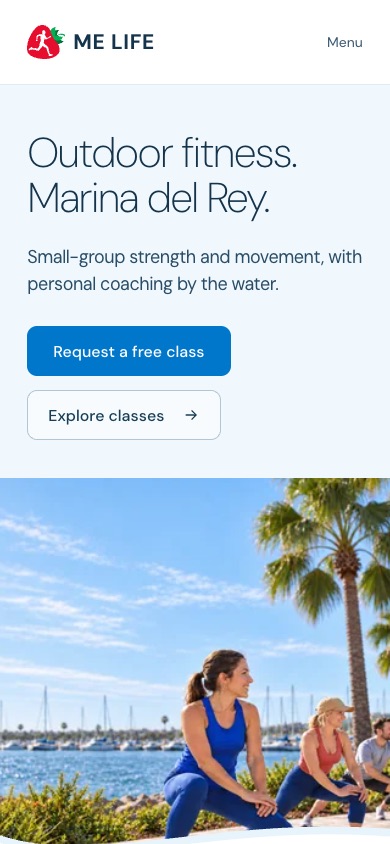
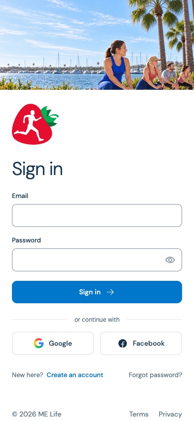
On mobile, the hierarchy stays intact. The promise, the primary action, and the setting arrive in that order. The design is not a desktop composition squeezed into a phone; it is the same idea rebuilt for a smaller decision space.